
Colours
Overview
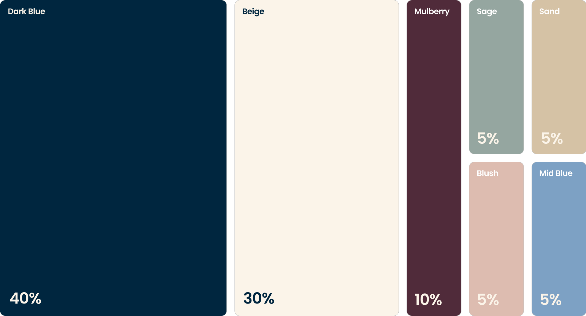
Our colour palette is designed to create clarity, hierarchy and consistency across every touchpoint. A structured ratio ensures the brand feels calm and considered, with stronger tones used with intent, and lighter supporting accents providing balance and space.
- CMYK:
- 100 39 0 75
- RGB:
- 0 38 63
- Hex:
- #00263f
- CMYK:
- 0 2 7 1
- RGB:
- 251 244 233
- Hex:
- #fbf4e9
- CMYK:
- 0 46 27 68
- RGB:
- 80 43 58
- Hex:
- #502b3a
- CMYK:
- 36 17 0 23
- RGB:
- 125 161 196
- Hex:
- #7da1c4
- CMYK:
- 0 8 22 16
- RGB:
- 213 194 165
- Hex:
- #d5c2a5
- CMYK:
- 0 14 20 13
- RGB:
- 221 188 176
- Hex:
- #ddbcb0
- CMYK:
- 10 0 3 34
- RGB:
- 149 166 160
- Hex:
- #95a6a0
Colour Rules & Ratios
Dark Blue is our lead colour, the foundation of the brand. This colour underpins the core visuals of Knights. Use for; Hero backgrounds, key brand moments, high-impact layouts.
Beige is our base colour. A subtle and confident backdrop for content. Use for; Page backgrounds, content-heavy web pages, supporting layouts where clarity is key.
Mulberry is used as an alternative to our Dark Blue, giving flexibility and variation when required. Never used in isolation or in one-off branded materials, the Mulberry should support the lead colour as a confident background alternative.
Accent colours: A set of complimentary tones used to introduce subtle variation and moments of distinction. Use for; Illustrations and graphic details, highlights within layouts, variation in a supporting role.
Shades and Tints
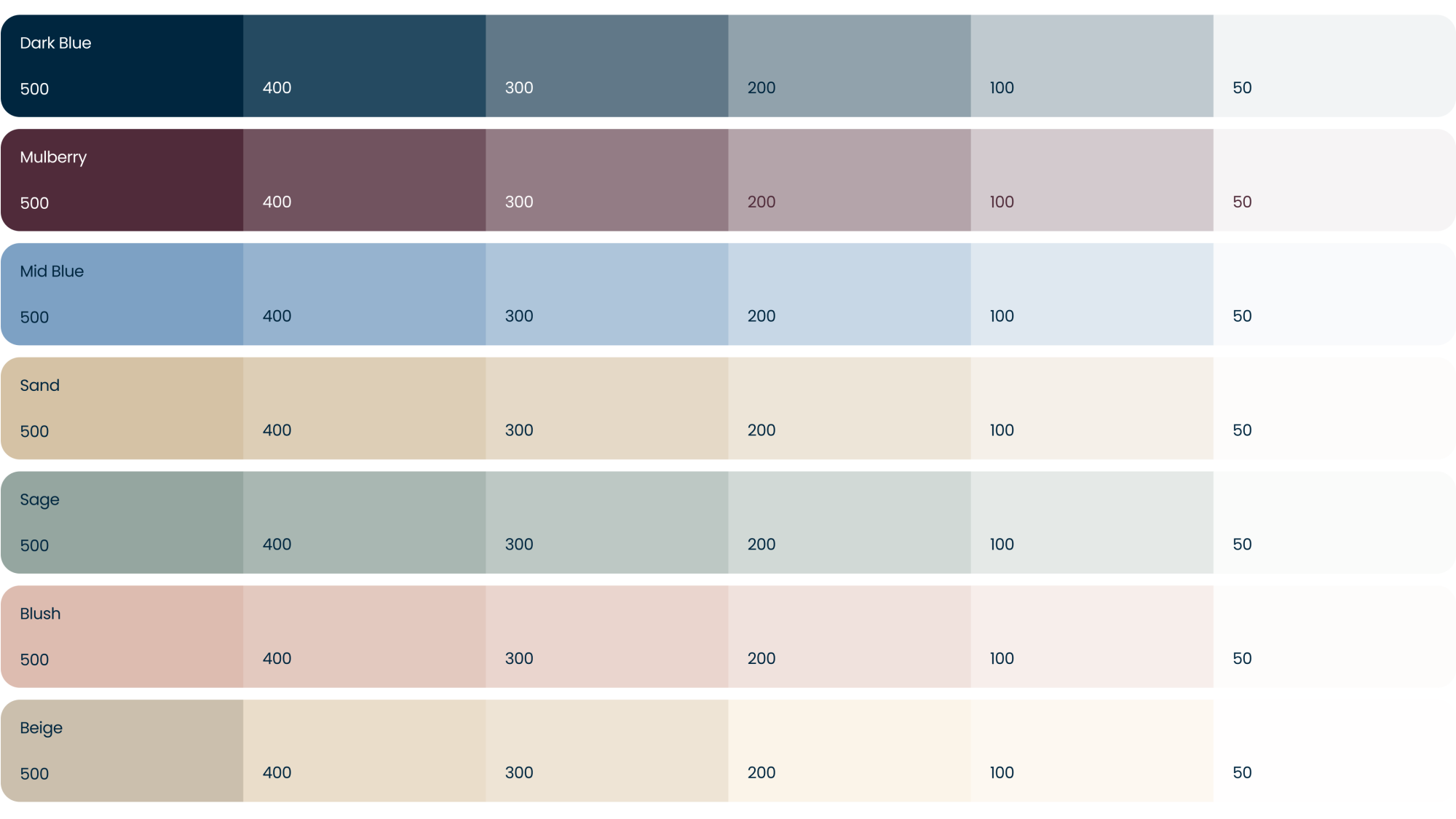
We can utilise a a range of tints & shades from these colours shown below. This further enables the Knights brand to work more tonally across print and digital outputs for when we need to achieve more subtle contrast results.