Graphics & Imagery
Graphic Language
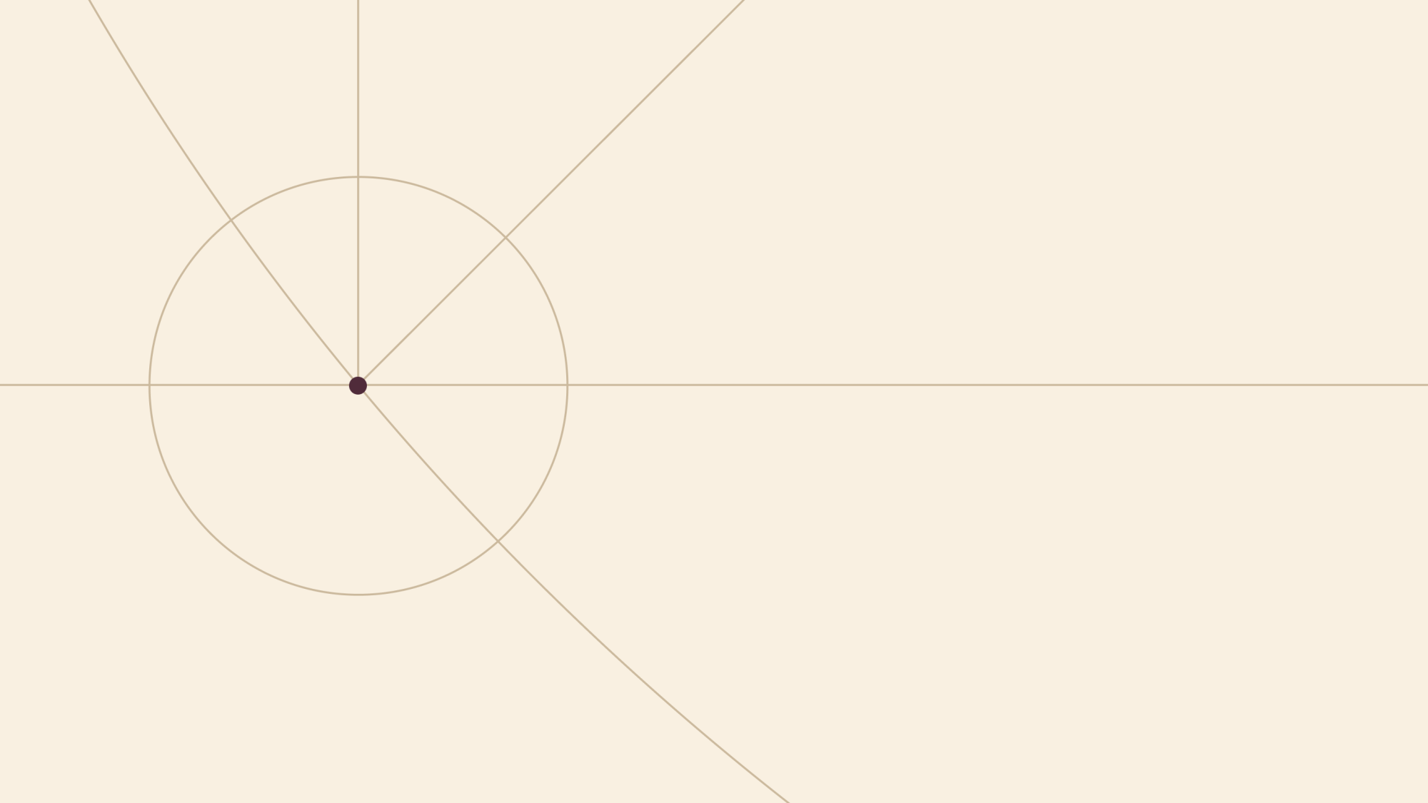
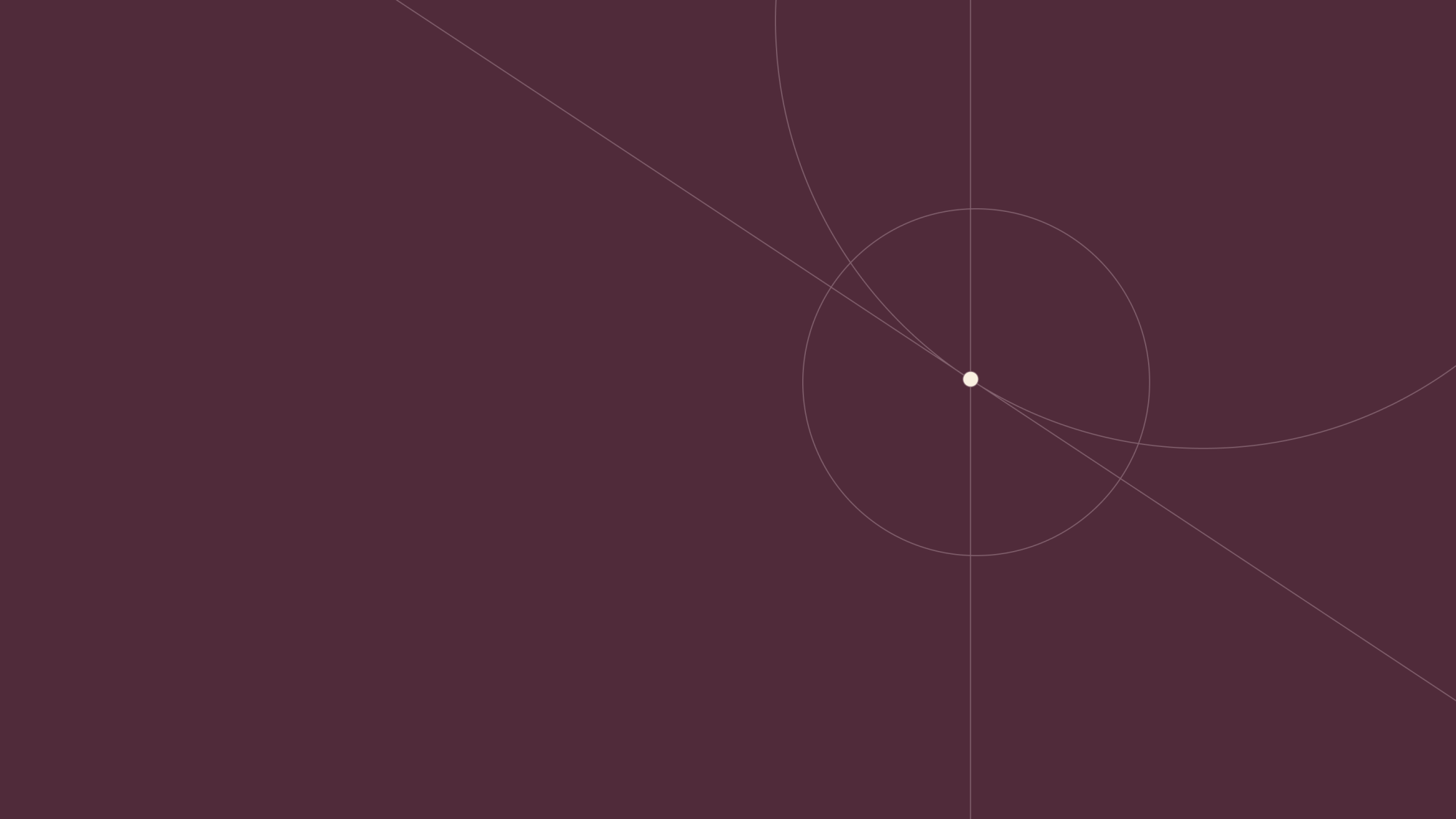
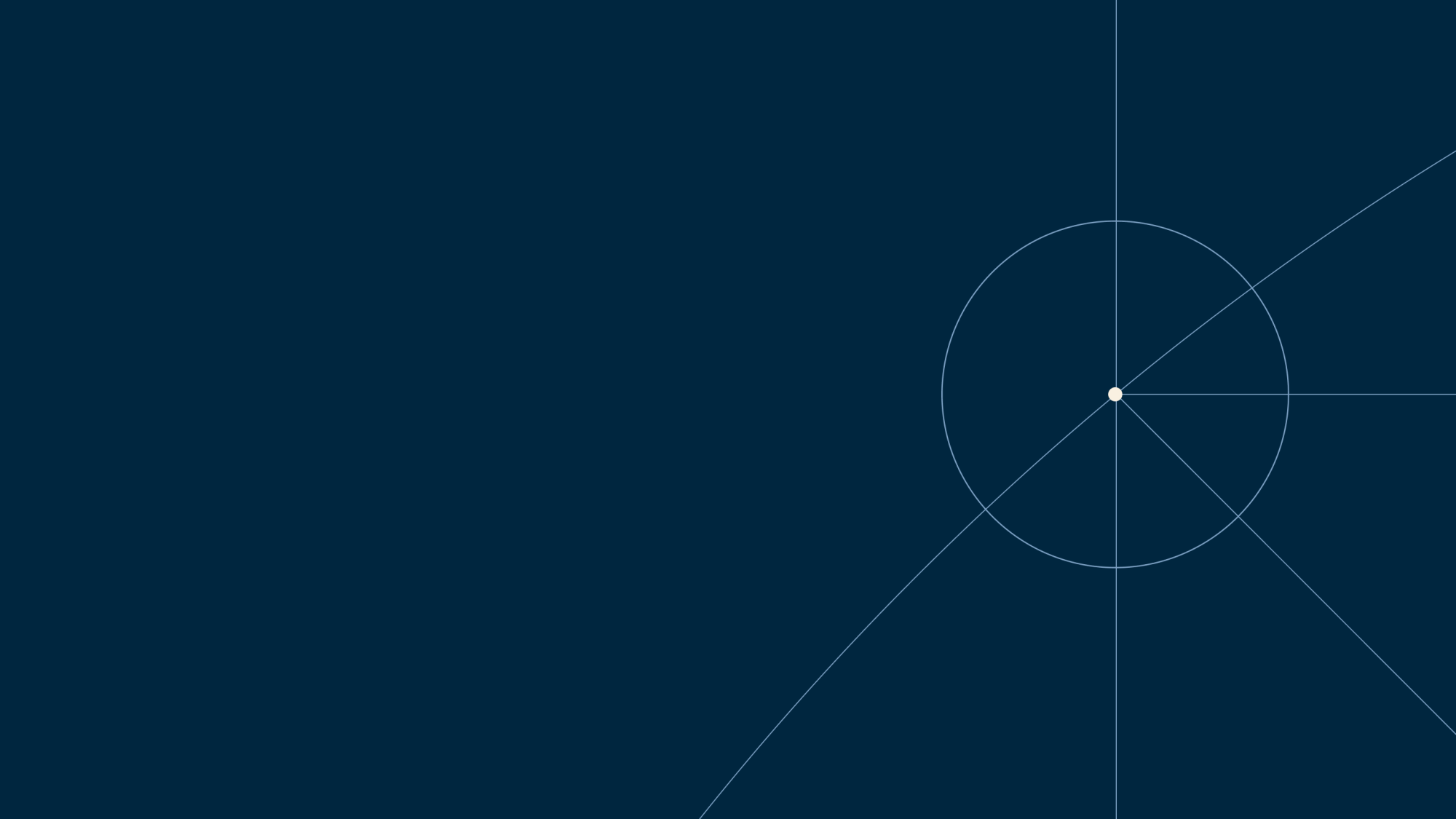
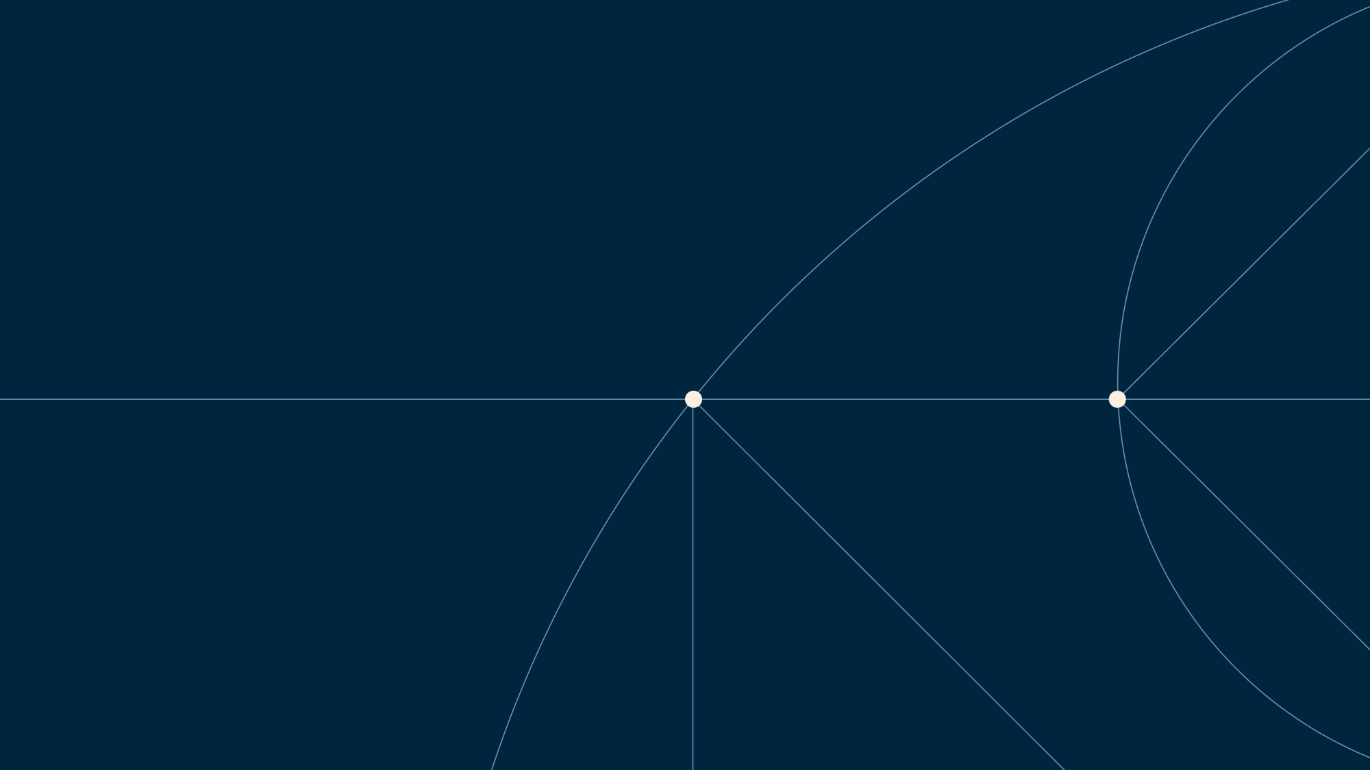
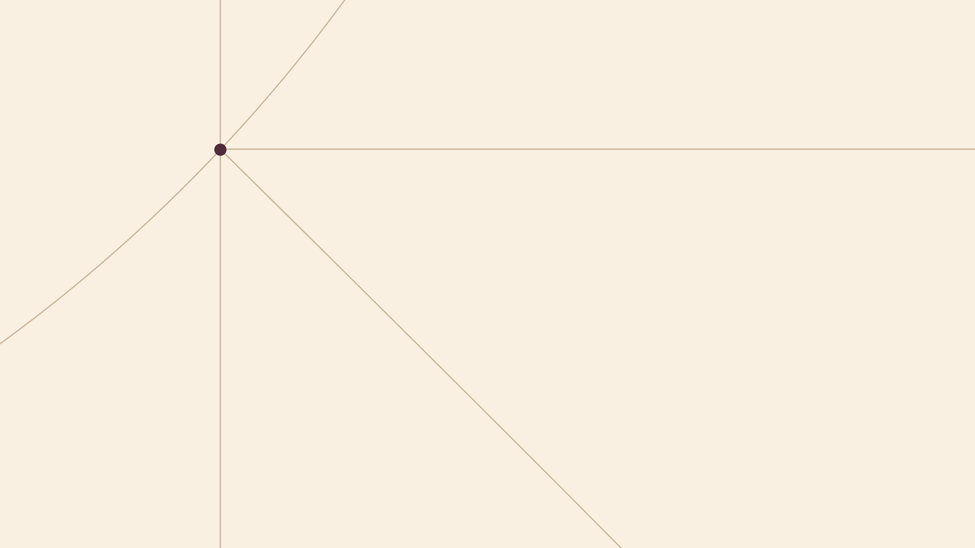
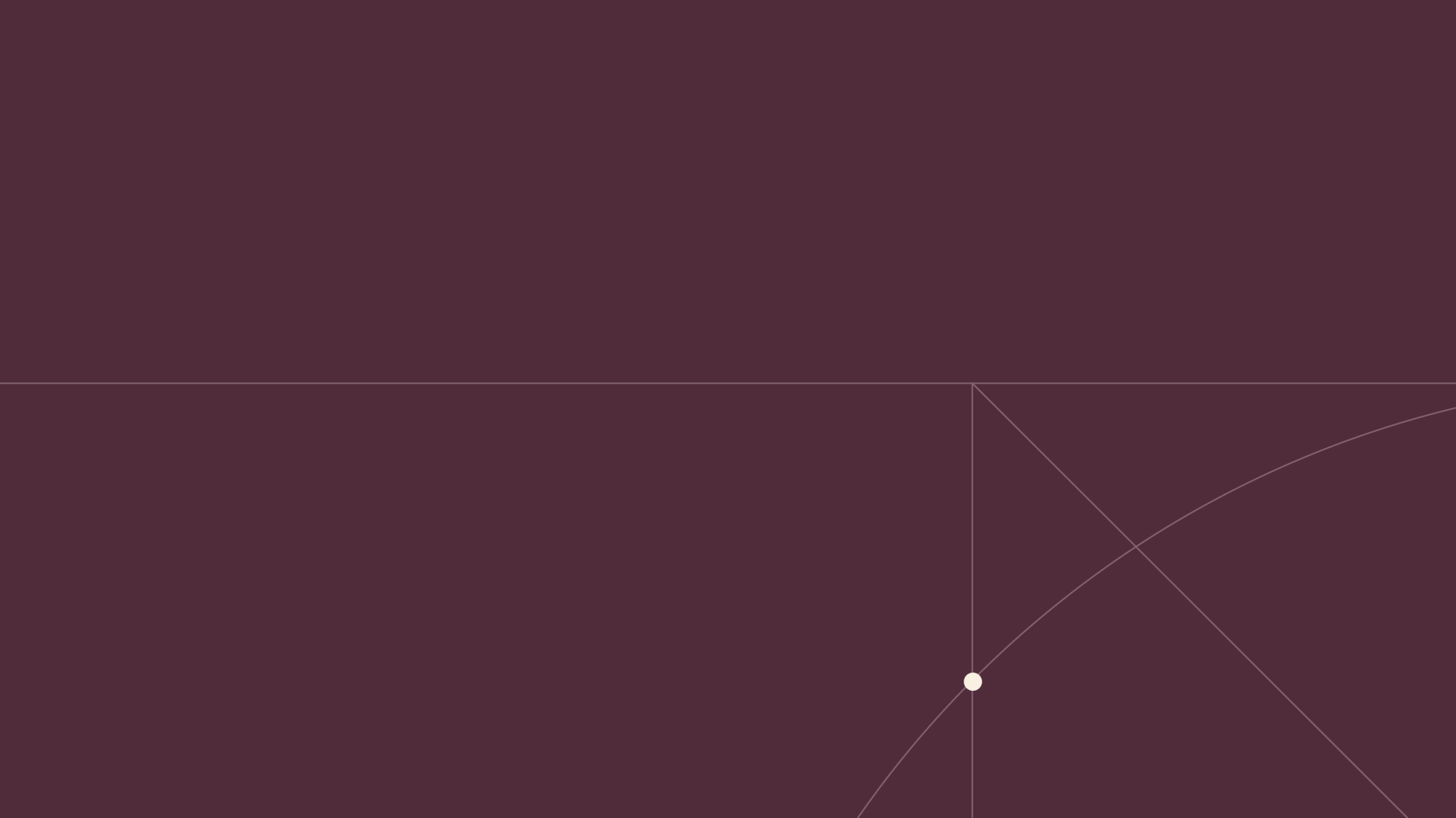
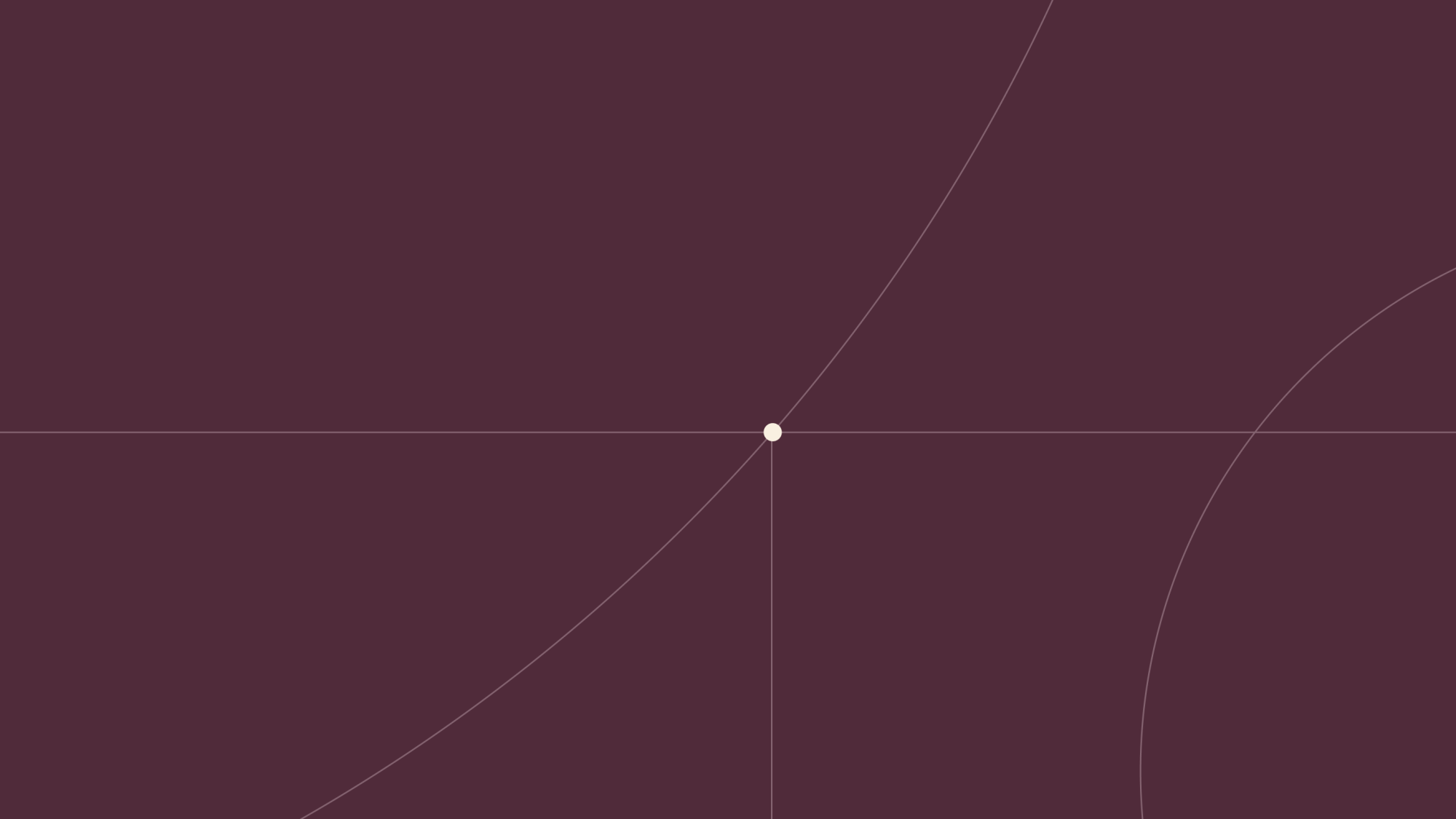
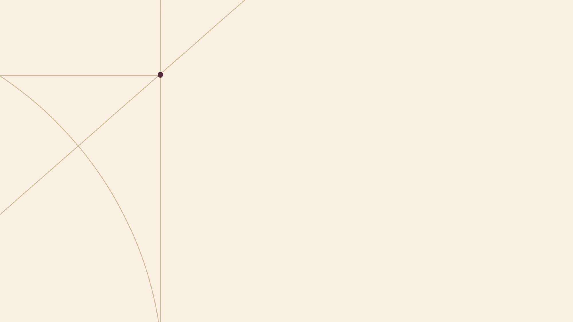
A visual language of lines and convergence — expressing how regional teams and national specialists come together to solve complex problems. Our graphic system represents the way Knights brings the right expertise together around clients when it matters most.
Graphic Fundamentals
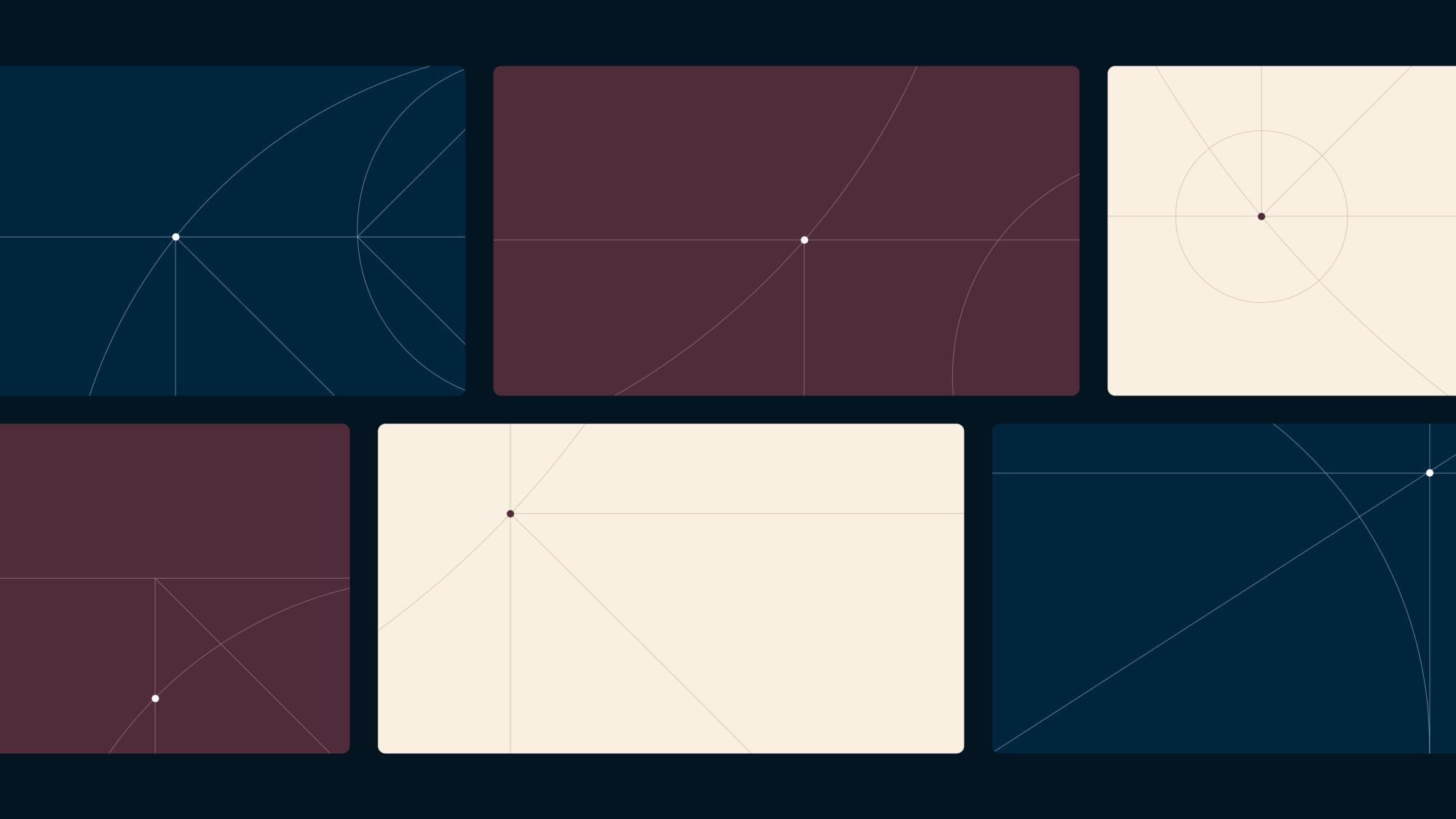
Using a focused set of core elements — straight and angled lines alongside organic curves derived from circular forms — a wide range of graphics can be created. These representational graphics can then be expanded and evolved using the wider system rules and design elements.
These are used to create a sense of movement, scale and connection. Reflecting the bigger picture: how expertise flows across regions and disciplines.
Graphic Guidelines
When creating new lined graphic layouts, follow the guidelines below:
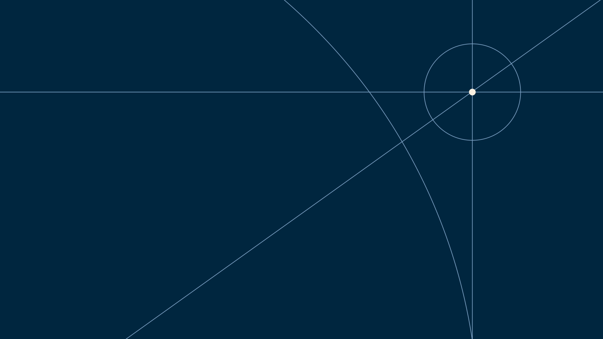
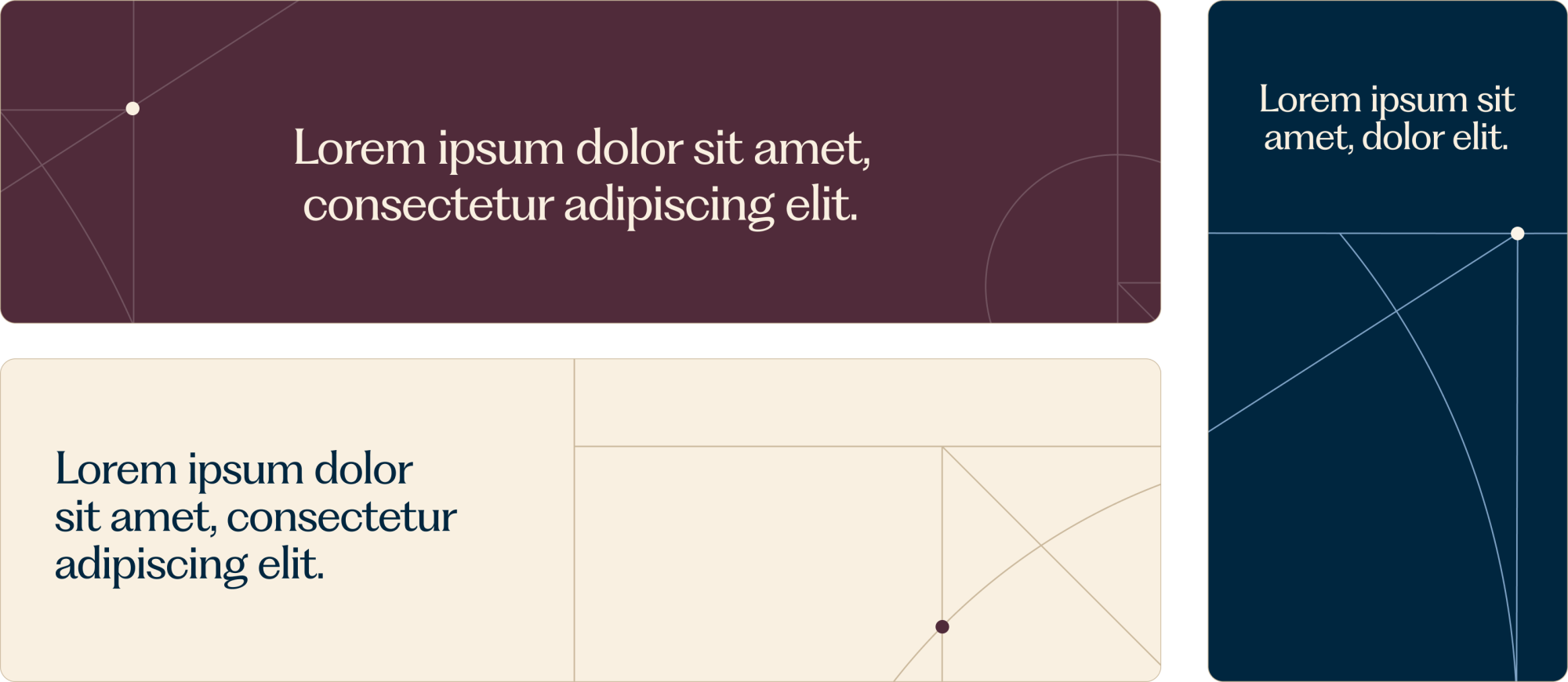
- Use lines to create space, structure and hierarchy, helping guide the viewer’s eye through the content.
- Keep convergence points to a minimum (maximum of two per layout).
- Use lines to divide and organise the composition to create zones where text can be applied.
- Apply lined graphics only on Dark Blue, Beige and Mulberry backgrounds.
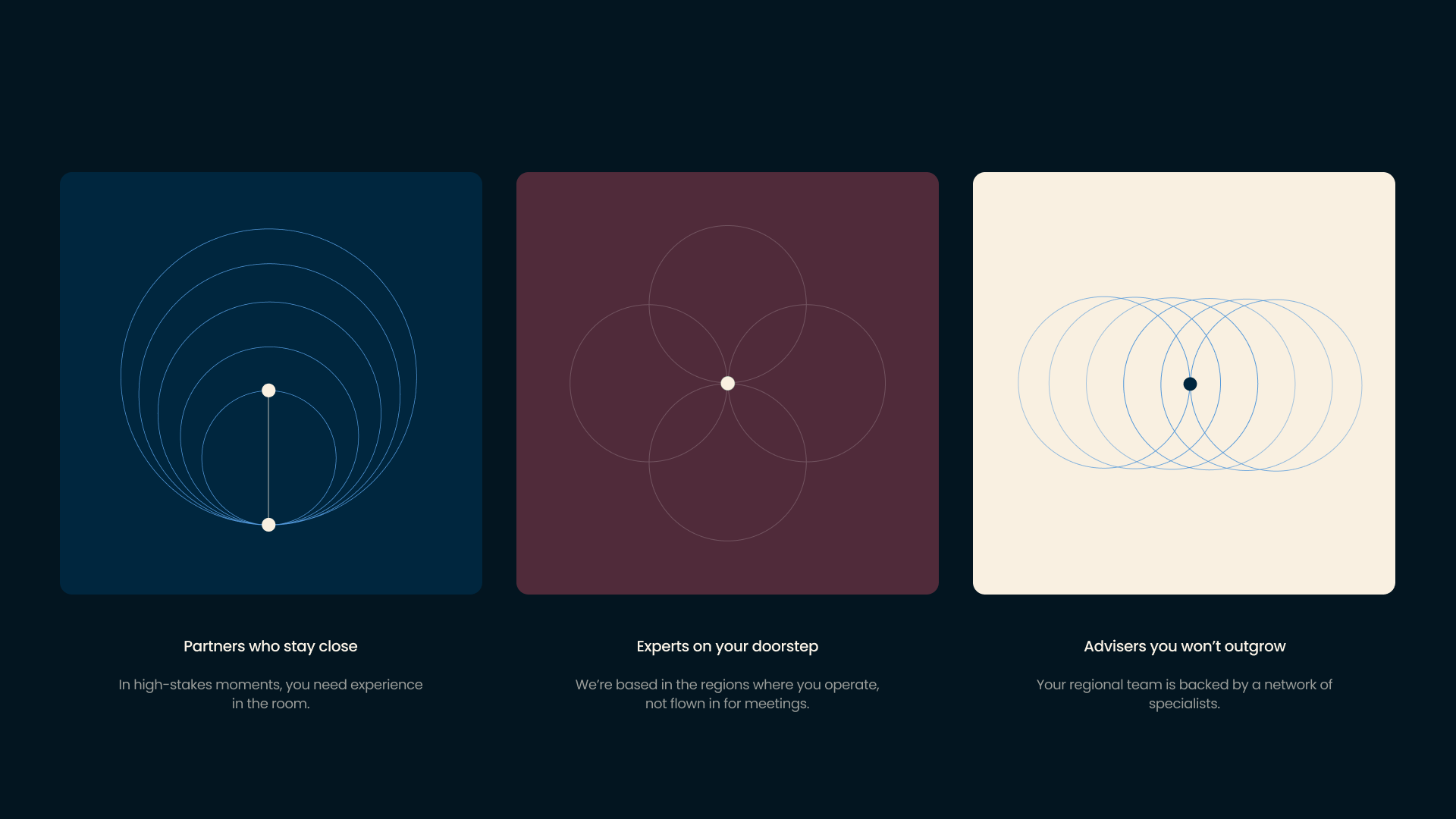
Representational Graphics
These are used to frame specific services, solutions and propositions – simplifying complex ideas and making them easier to navigate.
Photography Style
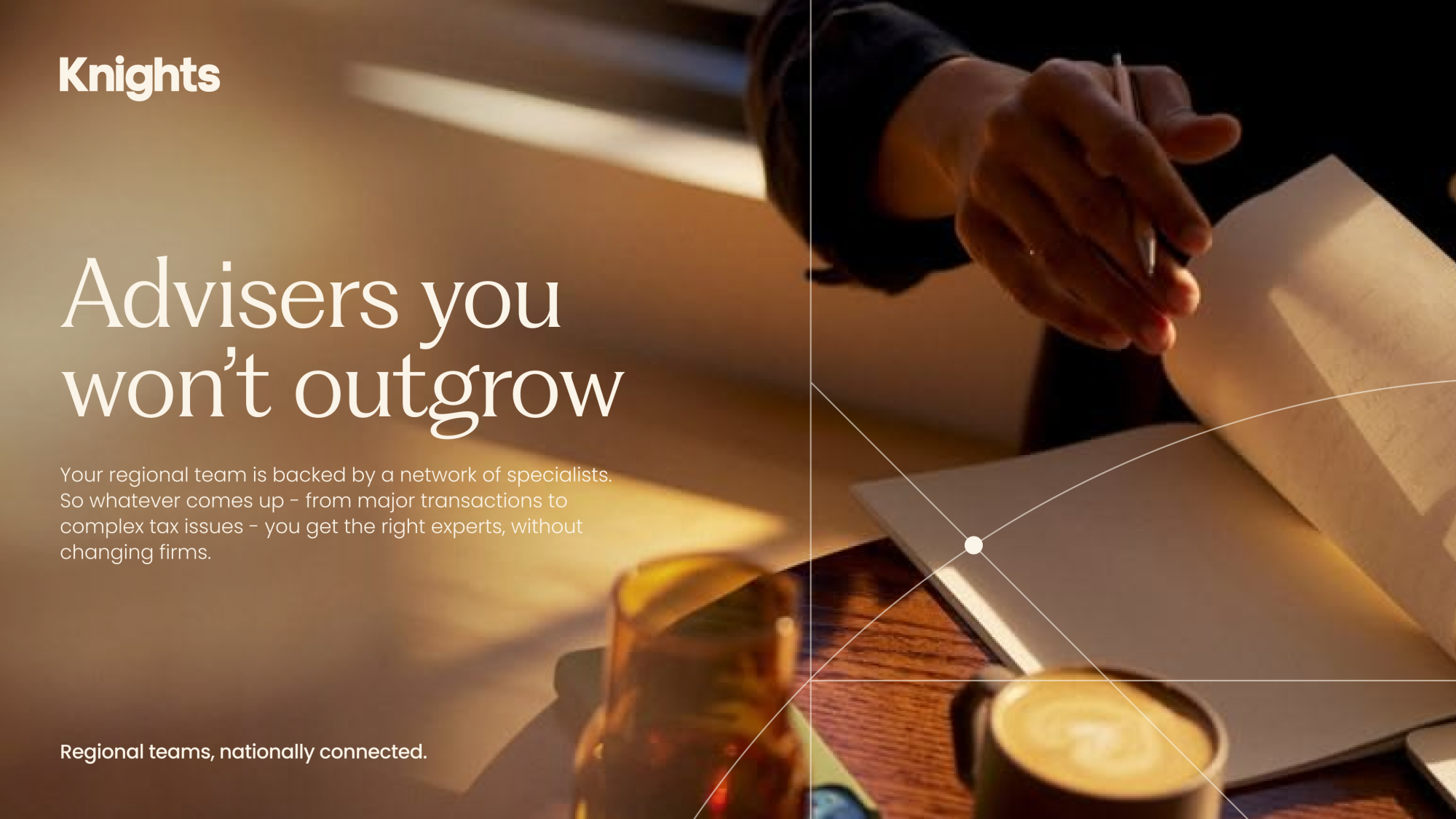
Photography should feel natural, warm, and authentic. Capture people in real moments rather than staged scenarios, with candid expressions and relaxed body language. Lighting should be soft and natural where possible, avoiding harsh shadows or overly dramatic effects. Environments should feel lived-in and relevant, helping to ground the subject in a real context.

Photography + Graphics
Photography can be layered with our lined graphics to add depth and composition. The lines can sit over the image to bring in precision and clarity, while the frame helps organise the layout and text.