
Our Logo
Primary Logo
Our primary logo is supplied in four colourways, with Navy and Beige our primary usage and Light Blue and Mulberry our secondary. Always choose the version that ensures clear visibility and strong contrast with its background.
Logo Clear Space
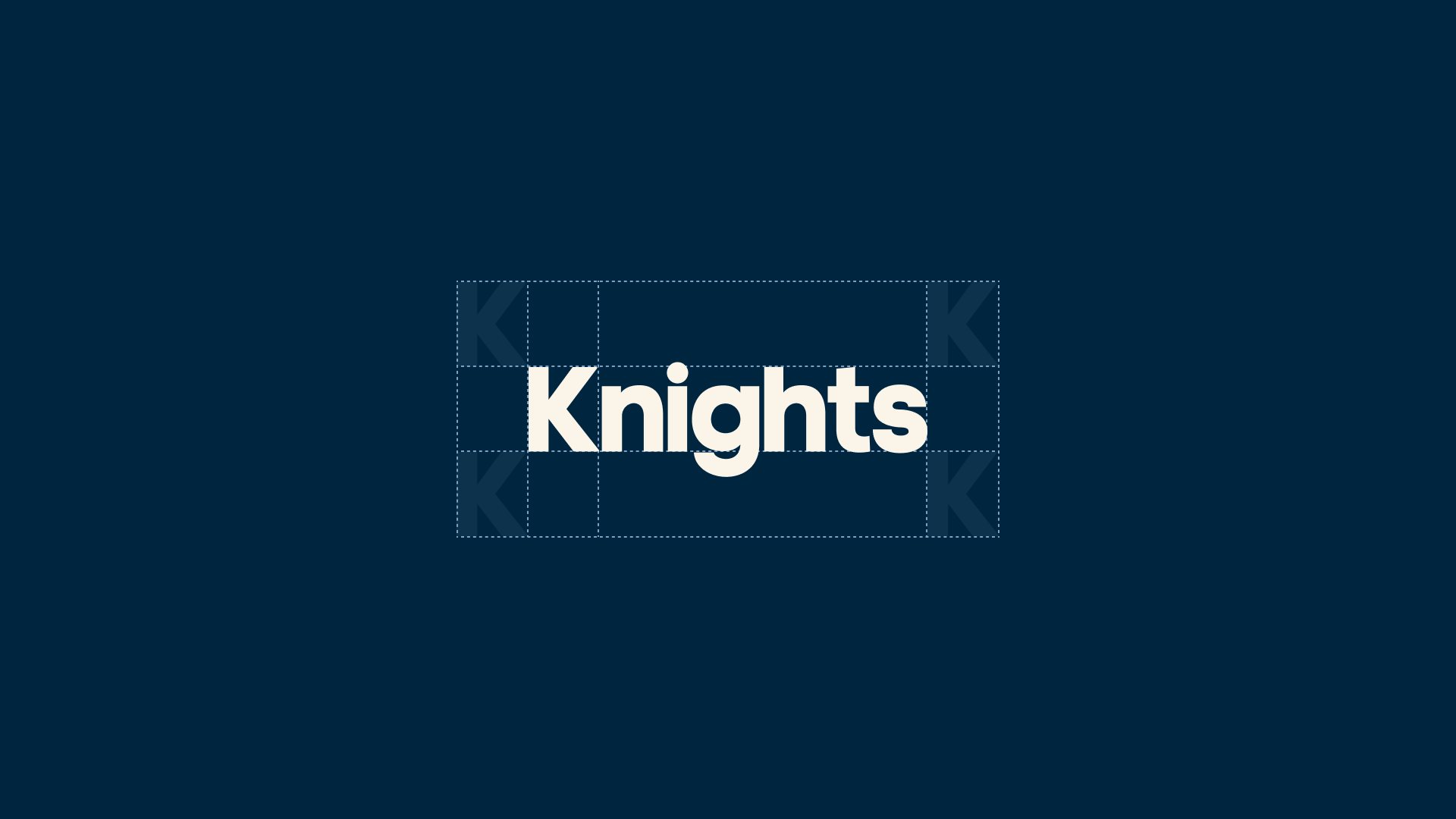
Use the height of the letter ‘K’ within our logo to determine the minimum clear space around the logo. This area must remain free from any other design elements.
Icon Mark
Our icon mark should be used in instances where the logo needs to appear at smaller sizes, such as a website favicon or social profile image.
Icon Mark Clear Space
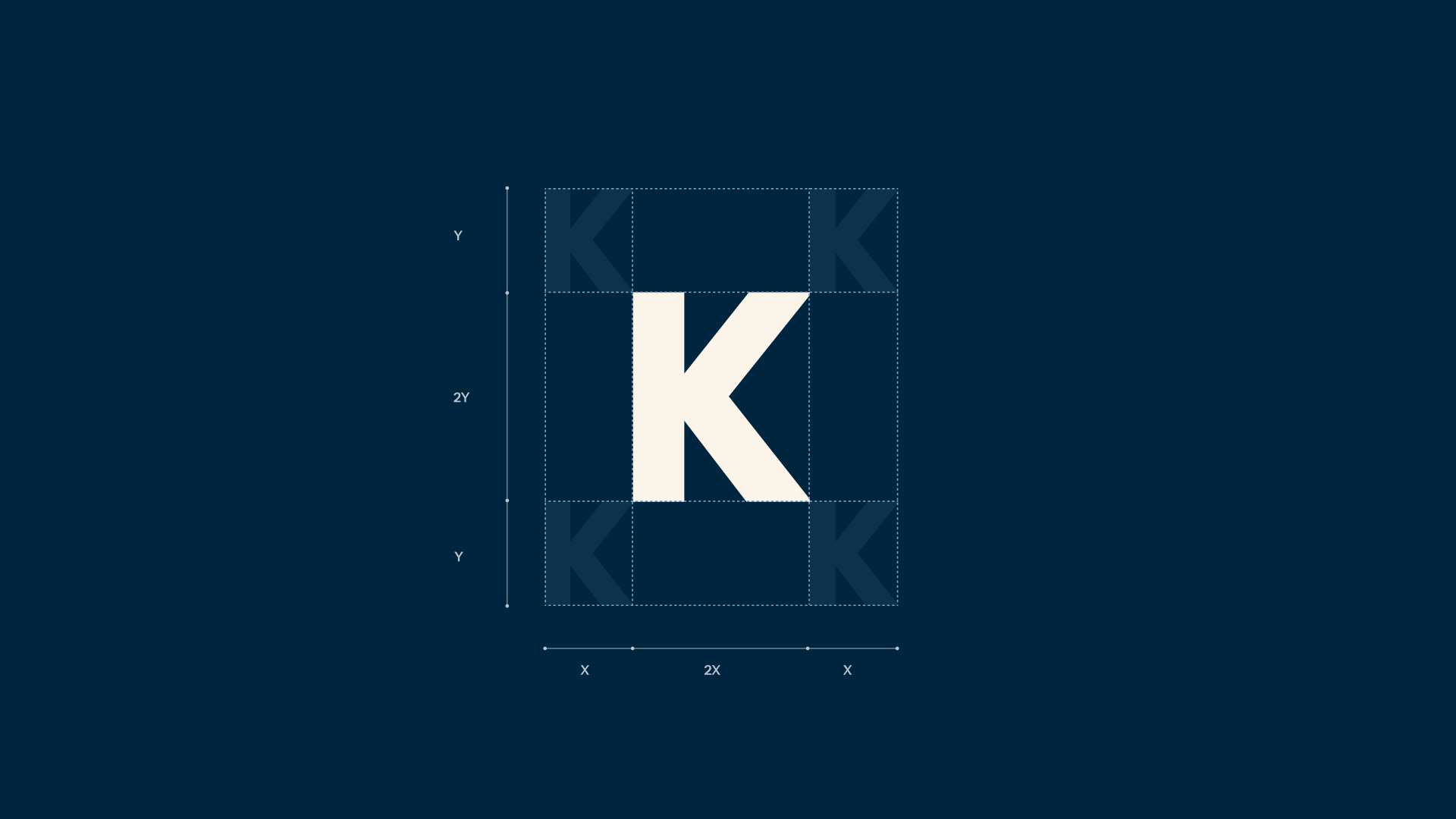
The clear space is defined using a 50% of the ‘K’s’ height and width. This measurement is applied on all sides to ensure the icon has enough room to breathe and remains visually clear across applications.
Partner Logo Lockups
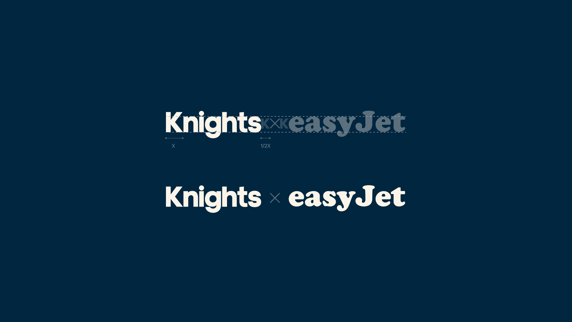
For partner logos that are horizontally formed, match the height of the partner’s logotype to the height of the Knights log text and use the 1/2 the size of our ‘K’ as a spacer between the logos and ‘X’.